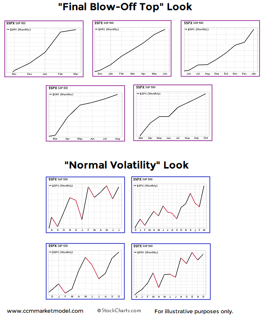
Monthly Charts From Nine Different Periods
A common stock market narrative in 2018 goes something like this:
The consistent gains and low market volatility are the hallmark of a blow-off top in stocks.
Is it possible that a consistent, low-volatility market is a common characteristic of early-stage secular bullish moves? The S&P 500 monthly charts below come from nine different periods.
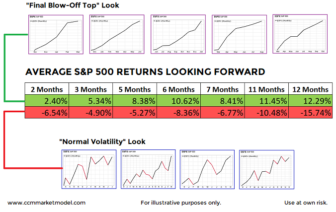
How did stocks perform after the looks above? Were the low-volatility periods followed by horrible bear market losses? The answer is no.
How About 2018?
In fact, 2018 was included in the charts above, and it clearly looks more like the favorable periods relative to the unfavorable, higher-volatility periods.
Full Details In Video Below
The charts and concepts are described in detail in the video below.


