Stock Performance Following Six Straight Weeks Of Gains In Q4

GLOOMY MANUFACTURING SURVEY FOLLOWED BY GAINS

In early October, a weak ISM Manufacturing Survey was followed by talk of an imminent recession. A factual analysis of similar drops in the manufacturing survey told us to keep an open mind about better than expected outcomes. The market responded with six consecutive weeks of gains (see chart below).

ciovacco-cmm-market-model-chris-spx-6.png

Given Q4 and Q1 offer some of the more favorable seasonal tailwinds, we wondered how stocks have performed in the past following a period of six consecutive weekly gains in the S&P 500. We looked for cases where the six-week streak began in the fourth quarter. As shown in the table below, stocks were higher one year later in 86% of the cases posting an average gain of 8%. Two and five years later, the S&P 500 was higher in every case. The yellow and red portions of the table remind us to have realistic expectations about normal volatility over the next three months.

short-takes-ciovacco-six-weeks-consecutive-spx.png

MAJOR BOTTOM OR MAJOR TOP?

With many calling for stocks to peak soon, it is easy to forget the S&P 500 recently dropped almost 20%. Therefore, rather than assuming a major peak is coming soon, it is logical to ask:

Is there any factual basis to believe December 2018 marked a major stock market low?

Cash Balances Could Push Stock Market Much Higher

HIGHEST IN A DECADE

According to Lipper and The Wall Street Journal, money market balances were basically identical on October 30, 2019 and March 25, 2009.

ciovacco-short-takes-chris-wsj-graph-cash-levels.png

It is easy to understand how money market balances reached extremely high levels in March 2009, given investors had just lived through a painful 56% drop in the S&P 500.

ciovacco-capital-short-takes-cash-levelsa.png

It is also easy to understand how the $3.41 trillion in money market funds on March 25, 2009 helped push the S&P 500 much higher over the next six years.

ciovacco-capital-short-takes-cash-levelsb.png

Given the technical and fundamental facts we have in hand today, it is a bit more difficult to understand how money market balances, just three short weeks ago, were sitting at basically the same level seen in the wake of the 2007-09 crisis that featured the collapse of several key components of the global financial system.

ciovacco-capital-short-takes-cash-levelsc.png

A SMALL PART OF THE WEIGHT OF THE EVIDENCE

From The Wall Street Journal:

“Assets in money-market funds have grown by $1 trillion over the last three years to their highest level in around a decade, according to Lipper data. A variety of factors are fueling the flows, from higher money-market rates to concerns over the health of the 10-year economic expansion and an aging bull market. Some analysts say the heap of cash shows that investors haven’t grown excessively exuberant .”

This post covers a set of facts; nothing more and nothing less. Even if the data above can be explained away, it would have little impact on the weight of the evidence covered in last week’s video. As always, we will continue to take it day by day and see how the facts unfold. We will most likely be covering several new studies in the next CCM weekly stock market video.

Today Looks Nothing Like A Blow-Off Stock Market Top

1929: THIS IS WHAT A MELT-UP LOOKS LIKE

Prior to the major stock market peak on September 3, 1929, the Dow Jones Industrial Average gained 97% over the previous 661 calendar days.

ciovacco-capital-market-model.png

1987: IRRATIONAL EXUBERANCE LOOK

When the stock market peaked in 1987, it was extended in a big way. The gain over the previous 661 calendar days was 76%.

ciovacco-capital-market-model-1987.png

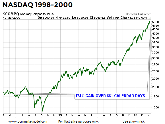
2000: THIS IS WHAT A BLOW-OFF TOP LOOKS LIKE

Blow-off tops are rare, but they do occur from time to time. One of the best examples in history is the final leg up in the NASDAQ before the bubble popped in 2000. It is an understatement to say the market was extended and vulnerable on March 10, 2000. Looking back 661 calendar days from the peak, the NASDAQ had tacked on an unbelievable 174%.

ciovacco-capital-market-model- nasdaq-blow-off-top.png

THIS IS WHAT NOVEMBER 2019 LOOKS LIKE

Instead of posting eye-popping gains, like 97%, 76%, or 174%, if we look back over the last 661 calendar days, the S&P 500 has gained a modest 8.5%. Risk speaks to being extended from a base (see three cases above). In 2019, we are just now trying to break out from a long-term base. Relative to history, the terms “melt-up” and “blow-off” do not apply to the facts we have in hand today.

ciovacco-capital-market-model-2019-11.png

2019 LOOKS LIKE THE EARLY STAGES OF A NEW TREND

This week’s stock market video covers a wide range of bullish and bearish periods from history to test the cyclical-low hypothesis that was formed in January 2019. You can draw you own conclusions after seeing comparisons to 1929, 1974, 1987, 2000, and 2007.

DAY BY DAY ACCORDING TO THE DATA

The charts above help us with the same “keep an open mind about all outcomes” concepts that were captured in the blurb below from a February 20, 2019 Seeking Alpha post:

“Having something concrete and measurable that differentiates 2018-2019 from three of the greatest percentage-decline bear markets in history (73-74, 00-02, 07-09) speaks favorably to bull/bear probabilities in February 2019.”

The data we have in hand today tells us the market’s upside potential is much greater than many can wrap their minds around. If the data deteriorates in a meaningful way, we must be flexible enough to reassess the odds of good things happening relative to the odds of bad things happening.