Are Financials Hinting At 2011/2016-Like Stock Market Rally?
TRYING TO MAKE A RELATIVE TURN
The chart below shows the performance of financial stocks (XLF) relative to the S&P 500 (SPY). Since making a low in late 2011 (point A), the XLF:SPY ratio has been trading in the slightly upward-sloping blue trend channel. Anecdotally, it is interesting to note point A came on November 30, 2011 and point B on July 31, 2016; both attractive entry points for the general stock market.
The tables below show S&P 500 and NASDAQ performance following point A and point B, telling us to keep an open mind about better than expected outcomes in the stock market over the next two years. The first 30-90 days reflect normal market volatility, meaning even if good things happen over the next two years, we should expect pullbacks, red days, red weeks, and red months.
Given the wide fluctuations in the correlation between XLF:SPY and SPY, the XLF:SPY channel above falls into the “that’s interesting” category. However, the concept of shifting bullish momentum, similar to the turns in 2011 and 2016, aligns with a broad array of evidence in 2019. For example, numerous growth-oriented ETFs made 2016-like turns in Q1 2019, as noted in the tweet below dated February 4.
WHAT ABOUT RED DAYS?
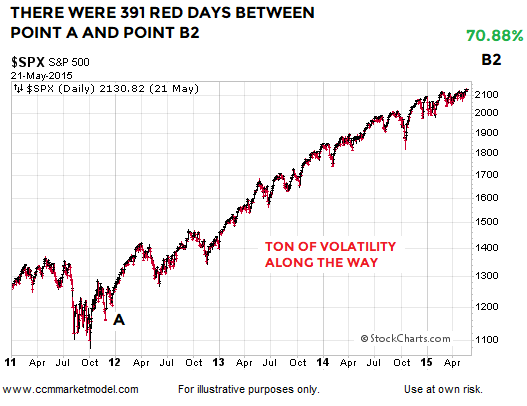
Point A in the XLF:SPY graph is November 30, 2011. The S&P 500 gained over 70% between point A and point B2 (graph below). To capture that gain, an investor had to endure 391 red trading sessions with an average decline of 0.56%. There were 481 green trading days with an average gain of 0.57%. Therefore, we learn very little about the market’s long-term health by reviewing a red day or cluster of red days in isolation. Red days are normal and to be expected.
OTHER FORMS OF EVIDENCE
This video clip covers numerous forms of “be open to better than expected outcomes” evidence that has accrued in 2019. When new data comes to light, evidence can shift. Thus, nothing says the XLF:SPY ratio can’t experience a bearish breakdown and negate the pattern that has been in place since 2011. For now, the longer-term evidence we have in hand remains constructive. We will continue to take it day by day, while remaining open to all outcomes, from wildly bullish to wildly bearish.
Tracking The Stock Market's Progress Versus Historical Cases
STUDY UPDATE
A March 1 analysis covered historical cases similar to the 2019 setup shown below, where the S&P 500’s 100-day moving average (blue) dropped below a flattish-to-down 200-day (red). Stocks rallied and the market closed above the 200-day for eleven consecutive trading days.
If we fast forward to April 3, 2019, the S&P 500 only closed below the 200-day twice during the period spanning thirty-six trading days. A ratio of 2/36 speaks to limited selling pressure.
HISTORICAL CASES
The tables below provide a “walk forward” update to the same cases covered in the original March study. Our goal in the updated study was to see how the stock market performed in the historical cases taking into account the number of daily closes below the 200-day in the same thirty-six trading day window.
The strongest cases are shown in group one. In each instance, the number of closes below the 200-day in the thirty-six day period was five or less (column three below). The 2019 case fits into group one since there were only two closes below the 200-day in the thirty-six day window.
The second group features cases with weaker evidence over the thirty-six trading day study period. In group two, selling conviction was strong enough to create between eight and twenty-two closes below the 200-day (third column table below).
As we might expect, group one performance (stronger trends) was noticeably better than group two (weaker trends). In group one looking out one year, the average S&P 500 gain was 12.92% and 94% of the eighteen cases featured positive returns. Group two cases produced an average loss of 13.70% after one year, with only one profitable case. We can learn a lot about the market’s present-day health by tracking and observing present-day facts; a concept that is quite a bit different from attempting to predict or forecast an uncertain future.
LONG-TERM DOWNTRENDS
Some basic concepts regarding trends shed additional light on the data above. Lower probability markets tends to stay below their 200-day moving average and often feature a downward-sloping 200-day.
INDECISIVE AND HEALTHY TRENDS
Indecisive or range-bound markets tend to feature flattish moving averages and price oscillating above and below the moving averages (left side of chart below). Healthy and sustainable long-term trends tend to feature a high percentage of trading days that close above the 200-day (right side of chart below). Thus, the longer a market can stay above the 200-day in the early stages of a rally attempt, the higher the odds we are dealing with a new trend rather than a countertrend move that will be followed by lower lows. In 2019, the S&P 500 is trying to transition from the flattish/indecisive stage to the upward-sloping/higher-conviction stage.
NEW S&P 500 STUDY (1950-2019)
This week’s stock market video covers a recent rare setup on the weekly chart of the S&P 500 and subsequent stock market performance looking out three years.
DAY BY DAY
Thus far, selling pressure has not been strong enough to push and hold the S&P 500 below the 200-day moving average. Should fundamental issues come to light that create a shift in sentiment resulting in a prolonged stay below the 200-day, 2019 odds would begin to deteriorate in a bearish manner. We will continue to take it day by day open to all outcomes.


