STOCK PERFORMANCE FOLLOWING SIMILAR MOVES
Retail investors have erred on the side of caution in 2019. From a recent MarketWatch article:
Analysts said the “extremely cautious stance” of retail investors this year had been puzzling and acted as a drag for equity markets… Years of high bond inflows, such as 2012 and 2017 — and now 2019 — have typically been followed by weak bond fund inflows the following year.
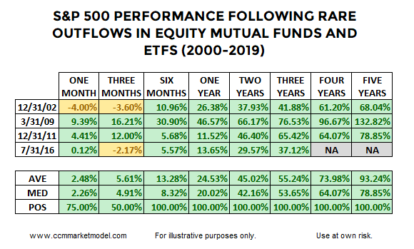
Not only have bond inflows been strong, but outflows from equity mutual funds and ETFs have come at a six-month pace similar to December 2002, March 2009, December 2011, and July 2016. The BNP Paribas chart below was posted on Mark Ungewitter’s Twitter feed.
Given unusually high rates of equity outflows align conceptually with unusually high rates of pessimism, it would not be surprising if stocks performed well walking forward from the four periods highlighted in the BNP Paribas graph above. The table below shows S&P 500 performance was quite attractive in all four cases.
The yellow portions of the table above help keep us grounded relative to how markets operate in the real world.
TODAY vs. SIGNIFICANT MARKET TOPS
It might be helpful to compare present-day equity fund flows to fund flows seen prior to the major stock market peaks in 2000 and 2007. As shown in the chart below, 2019 looks significantly different from March 2000 and October 2007.
REALISTIC EXPECTATIONS
After showing weak ISM Manufacturing Survey data was not necessarily a showstopper on October 1, the S&P 500 found its footing and made an intraday low of 2855 on October 3; from that low, the S&P 500 rallied 299 points, hitting the recent intraday high of 3154 on November 27. Some giveback or retracement after a 299 point move would not fall into the shocking category. Our focus is on longer timeframes.
VOLATILITY IS NORMAL, RATHER THAN ABNORMAL
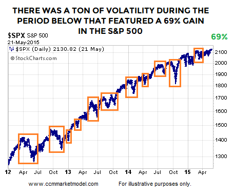
In the historical cases shown above, was it a cake walk after fund flows reversed? No, walking forward from the end of December 2011, stocks rallied for over three years, but that move had plenty of normal-and-to-be-expected volatility between point A and point B. It is easy to look at the chart below and say, “Yes, we all know markets have red days and corrections during an uptrend”. It is a little bit harder to respect normal volatility when the market is open and your screen is covered in red.
WEIGHT OF THE EVIDENCE
The fund flows analysis above aligns with a recent study of stands near the 200-week, relatively high cash balances, and recycled DeMark counts.
WEEKLY VIDEO
The Thanksgiving week video opens with the possible significance of the monthly MACD cross that was nailed down after the Dow’s close on Friday, November 29.
DAY BY DAY
All of the above speak to probabilities, which is significantly different from certainty. We will continue to take it day by day with an open mind about a wide range of outcomes, from wildly bullish to wildly bearish.


