DAILY MOMENTUM 2019 vs. 2007
S&P 500 momentum is determined by the net aggregate opinion of all market participants and thus, helps us assess the market’s risk/reward profile. On a daily timeframe, the S&P 500 has a MACD bullish cross and MACD remains above the centerline, which odds-wise speaks to a bullish primary trend. The second chart allows us to compare the present day to the early stages of the 2007-2009 bear market.
WEEKLY MOMENTUM 2019 vs. 2008
When we compare 2019 to 2007-08 on a weekly timeframe, we get similar results. The 2019 chart has a bullish MACD cross and MACD is above the centerline. The 2007-08 chart has a bearish MACD cross and MACD is below the centerline, which odds-wise speaks to a primary downtrend.
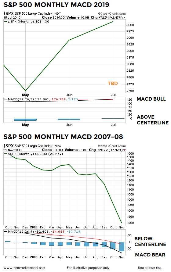
MONTHLY MOMENTUM 2019 vs. 2007-08
The S&P 500’s monthly chart is trying to nail down a bullish MACD cross this month; the outcome will be determined on the last trading day of July. The present-day chart looks quite a bit different from the 2008 chart, which features a bearish MACD cross and MACD below the centerline.
VIDEO INCLUDES A MORE DETAILED LOOK AT MACD
If the S&P 500 can print a monthly MACD cross at the end of the month, what could it mean for stocks over the next five years based on similar setups dating back to 1949? The answer can be found in this week’s video.
MORAL OF THE MOMENTUM STORY
Swings in momentum often lead price. Momentum is currently favorable on multiple timeframes, telling us to keep an open mind about better than expected outcomes in the years ahead.


