DOT-COM BUST BEAR MARKET
When the S&P 500 reached a bull/bear tipping point in March 2000, NYSE Advancing - Declining Volume was already waving yellow flags. As shown in the chart below, $NYUD was hugging its 50-week moving average and the 50-week was rolling over in a bearish manner.
FINANCIAL CRISIS BEAR MARKET
A similar and ominous rollover look occurred in $NYUD’s 50-week moving average soon after the S&P 500 peaked in October 2007. Notice how $NYUD tested the 50-week and then failed by dropping below the 50-week.
HOW DOES THE SAME CHART LOOK TODAY?
The 2017-18 version of the same breadth indicator looks nothing like the 2000 peak nor the 2007 peak. $NYUD remains well above a positive-sloping 50-week moving average and is near new highs, indicating a much healthier market versus 2000 and 2007.
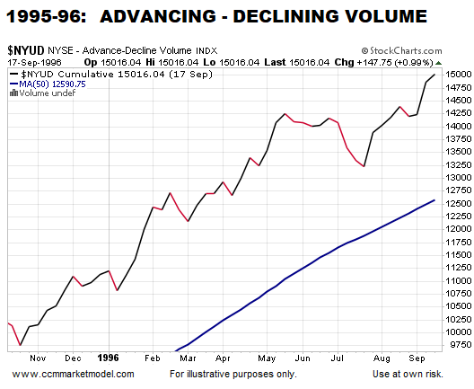
HOW DOES 2018 COMPARE TO A BULLISH PERIOD?
There is no question 2018 looks more like 1995-96 than the major stock market peaks in 2000 and 2007.
WHY IT IS IMPORTANT TO HAVE AN EXIT STRATEGY
This week’s stock market video covers the present-day market in the context of bear market migration strategies. Now is the time to water test your portfolio/asset allocation strategy.
UP/DOWN VOLUME IS ONE PIECE OF EVIDENCE
The charts above align with numerous data points that continue to favor long-term bullish outcomes for the markets and economy. If the data begins to shift in a meaningful way, we must be flexible enough to reassess the odds of good things happening relative to the odds of bad things happening.


