Facts Instead Of Fear
In a separate post, we compared 2018 to numerous plunge periods in history (1955, 1987, 1998, 2000, 2007, 2011, and 2015).
Having studied markets for years, we can confidently say the data we have in hand in 2018, on multiple timeframes, looks almost nothing like the data we had in hand before plunges in 2000 and 2007. The most similar periods are 1955, 1987, 1998, 2011, and 2015.
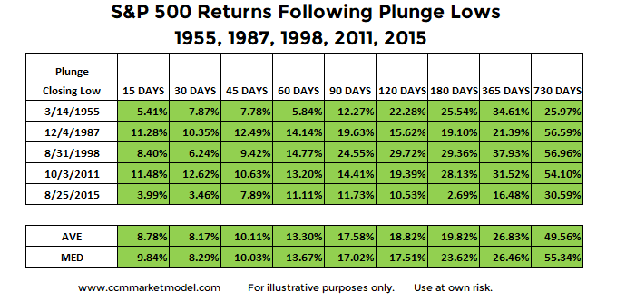
Therefore, it might be helpful to better understand what happened after the plunge was over in the five similar cases. Did stocks tank or did they find their footing and produce positive returns. The data speaks for itself.
Probabilities, Not Predictions
Is it possible stocks continue to tank over the next two years? Yes, anything is possible, but it is not probable based on the historical data and 2018 data. We will continue to take it day by day, with an open mind about any and all outcomes, from wildly bearish to outrageously bullish. If the hard data says we need to take defensive action, we will not hesitate. If the hard data says we should be patient and sit tight, we will choose the "do nothing" alternative.
Charts For All Cases, Including 2000 And 2007
The charts can be found here. Anything can happen in the markets, including very low probability outcomes, but it still makes sense to understand the probability of good things happening relative to the probability of bad things happening. It is best to maintain a flexible, unbiased, and open mind, which allows us to prudently interpret new facts over time.


