MYTH BUSTER: RISING OIL PRICES WILL KILL STOCKS AND THE ECONOMY
THE SAME NARRATIVE OVER AND OVER AGAIN
Jesse Livermore's "there is nothing new on Wall Street" applies to the never-ending commentary about the impact of oil prices on the economy, earnings, and the stock market.
We are currently in a "rising oil prices will kill the economy and stock market" period. Therefore, it is prudent to ask:
"Is it possible for stocks and the economy to perform well during a period of rising oil prices?"
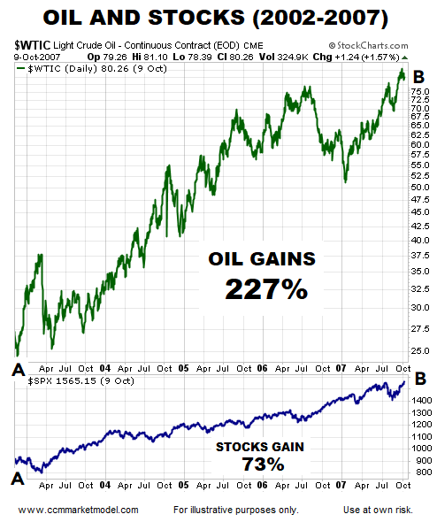
The chart below shows the price of crude oil and the S&P 500 between November 2002 and October 2007. As you can see, stocks gained 73% during a period that featured a 227% rise in the price of oil.
STOP WASTING ENERGY ON STOCKS AND THE PRICE OF OIL
It was not long ago that we were in a "falling oil prices will kill earnings and the stock market" period. The table below shows calendar years that contained a significant peak to trough decline in the price of oil. As you can see, stocks can perform just fine in years that feature a significant decline in the price of oil.
MORAL OF THE STORY
The correlation between oil prices and stocks is all over the place:
- Sometimes oil rises and stocks rise
- Sometimes oil rises and stocks fall
- Sometimes oil falls and stocks fall
- Sometimes oil falls and stocks rise
If you are trading or investing in oil, then it is prudent to track the price of oil. If you are trading or investing in the stock market, following the price of oil will do nothing but confuse you. There is no consistent or meaningful correlation between the direction of oil prices and the direction of the stock market.
THIS SIGNAL CAN FORESHADOW A SIGNIFICANT PRICE MOVE
CHARTS SPEAK FOR THEMSELVES
The S&P 500 peaked 101 days ago on January 26, 2018. Williams %R, which helps us track momentum, is shown at the bottom of each weekly chart below. The red arrow shows S&P 500 momentum reached "oversold" territory in March. During the subsequent drops (blue arrows), the bears were unable to push momentum back into oversold territory, which tells us to be open to better than expected outcomes in the weeks and months ahead.
THE NASDAQ LOOKS EVEN BETTER
Bullish momentum was so strong before the January 2018 peak that even after correcting/consolidating for 101 days, the NASDAQ has remained above oversold territory, which is a sign of strength.
2011 CORRECTION: NASDAQ
Compare and contrast the 2018 chart (above) to the 2011 chart (below). Notice how momentum was much weaker in 2011.
TECH STOCKS IN 2018
Like the NASDAQ, momentum in the technology sector (XLK) has remained incredibly strong since markets peaked in January.
TECH STOCKS IN 2007
Compare and contrast the 2018 chart (above) to the 2007 chart (below). Notice how momentum in the technology sector was much weaker in late 2007/early 2008.
S&P 500'S LONG-TERM OUTLOOK
In November 2016 bullish setups on the chart of the S&P 500 turned out to be helpful. This week's video revisits that analysis to see if the long-term bullish conclusions have been negated during the recent stock market correction.
MOMENTUM FAILURE IN 1998
When the bears had control of the short-term trends in 1998, they were unable to push bearish momentum back into oversold territory in late September/early October; this is known as a momentum failure (see blue arrow below). The momentum failure said "be open to better than expected outcomes in the weeks and months ahead".
According to StockCharts.com:
"The failure to move back into overbought or oversold territory signals a change in momentum that can foreshadow a significant price move."
WHAT HAPPENED AFTER THE MOMENTUM FAILURE?
After the bears failed to push momentum back into oversold territory in 1998 (blue arrow bottom of image), the NASDAQ found its footing and tacked on 240%. The box in the upper left hand corned of the image shows a similar situation on the present day weekly chart of the S&P 500, telling us to keep an open mind about better than expected outcomes in the weeks and months ahead.
Are Investors Overlooking The Forest Due To The Volatile Trees?
MOVING PAST DAY TO DAY VOLATILITY


